
So at their time of inception pedals were something both feared and accepted by guitarists. For the most part it was only the guitar and the amp ... that was it, and as a musician today I still feel that this is a great combination with the sheer abundance of options out there. But there were some looking to create a signature sound to give them an element of differentiation . They wanted the fuzz, wah, distortion, the thing that would make their guitar make sounds unheard before.
Some of the more flamboyant pedals came from the Japanese company Ibanez. These pedals were being designed and manufactured by the company Maxon in Japan but were being sold as Ibanez pedals in the United States. Ibanez seemed to take more product design and graphic liberties than other music companies. The boxes changed over the years, the graphics changed, and can easily be pigeonholed into their respective time periods.
Here are some of the first Ibanez pedals:
(images courtesy of stompnet)


The earlier pedals used typographic language and color to differentiate the different effects. There was also some experimentation with how these effects were controlled as well that played into the overall design. The standard fuzz utilized sliding controls as opposed to the traditional knobs. The type can almost be seen as little logos for each effect. Some effects are subtle and it seems like the type is reflective of that. For example a comparison of the chorus which is more of a subtle effect in comparison to the flanger which is more of a technical in your face science fiction sounding effect.
So in the next series of ibanez pedals it seems that the typographic language has simplified and there is a common look to all of the different effects. Manufacturing processes leads to most of the effects having the same box design, and changes in the color are the biggest differentials in the pedals. These pedals are emerging during the late 70s and early 80s.


Continuing in this pattern the boxes have a similar design in the mid 80s and exhibit a design language that easily point to their production era. The colors are bright and neon. The typographic language is congruent with the hair bands and the inspiration comes come record covers and fashion trends. Video games are also in the new so there is a lot of borrowed language ... the knobs that look like pac man, to the type that looks like something from an atari console. The box design even looks like something that you would more so plug into your tv than your guitar amp.


Looking at these series of pedals you can see that the typographic language is unchanged from one pedal to the next and like the late 70s series the biggest differentiating factor is the color.
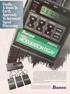
On to the next series ... these pedals came out in 1988


Then the early to mid 90's gave way to cheaper plastic boxes and to what some call the turtle shell design. These are probably the least sought after of the ibanez series of pedals because of their shoddy construction. All of the electrical components were similar to earlier models, but something about a box you are going to step on repeatedly needs to look like it can take a hit.


So finally on to the current production look of the ibanez pedals. They have taken color out almost all the way. The only area with color is a little square. It seems that over the years that the color has become less and less of a design factor. I personally think that this is an error from the originals and that is perhaps why so many musicians seek the original pedals. Think of it in a functional manner. You are a guitarist playing at a gig and you look down at your pedal board in this dimly lit club and all you see is gray boxes ... how the hell could you even see the little box. I would take full color boxes anyday ... color is a huge branding element. I think this study shows how strong that it is.


